 5typos.net
Updated personal logo
I love articles that show the design process for a website, UI or icon. Since I recently updated my twitter avatar and website favicon with a new design I thought it might be cool to show the different stages.
Design process:
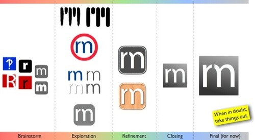
For creating most of my graphics I actually use Keynote. I think it’s because CorelDraw 7 was the program in which I learned. As a result, I’m a vector kind of guy.
I usually start with a rough idea and duplicate the slide when I reach a design I like but want to keep experimenting with. Otherwise I make another blank page and move from there. If I need to do something that requires image editing I copy it to Acorn, and then copy back. That’s how I removed the small piece from the m.
A simple update:
To be fair, I’ve been using the concept of combining my initials in one letter for a while. So it was on the back of my mind at all times. For some reason, I keep ending there. I just like a lot how both letters fit together, and I’m not the only one.

Looking ahead I want to add a little color to it. Maybe find a way for it to work better with my pic, since I believe that personal twitter accounts look better that way.